general @jrdesigners.art


It all starts with purpose: health, nutrition, and balance.
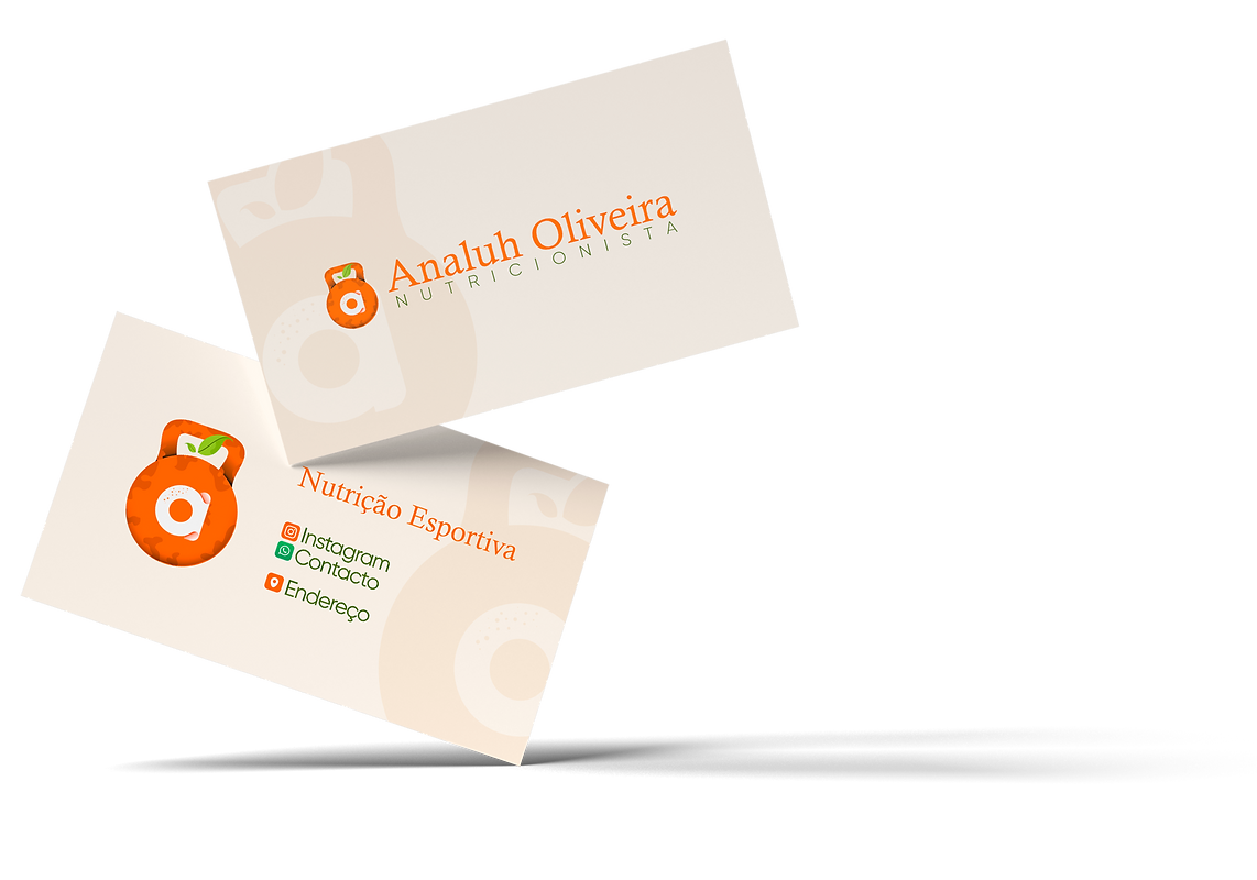
The kettlebell symbolizes strength and movement – essential elements on the journey to a healthy life.
It was adapted gently, bringing rounded shapes that convey warmth and care.
Inside, the letter "a" represents Analuh's name, in a light and friendly composition, connecting professionalism with approachability. The touch of seeds and the green sprout above translate the power of natural food and the rebirth of habits .


The vibrant orange typography of the name "Analuh Oliveira" conveys energy , vitality , and enthusiasm —everything that encompasses a vibrant and conscious approach to nutrition.
The word “NUTRITIONIST” appears below with ample spacing and in olive green: stability , health , and nature in visual harmony.
Colors that communicate purpose.
Vibrant Orange
#FF6600
CMYK: 0% - 77% - 100% - 0%
RGB: 255 - 102 - 0
Olive Green
#556C3E
CMYK: 70% - 39% - 100% - 29%
RGB: 85 - 108 - 62
Bright Red
#ED3237
CMYK: 0% - 99% - 100% - 0%
RGB: 237 - 50 - 55
Light Green
#A6CE45
CMYK: 41% - 0% - 100% - 0%
RGB: 166 - 206 - 69
Vibrant Orange
It conveys energy, motivation, and vitality. It represents the warmth of human connection in service and the transformation that begins from within.
Olive Green
A symbol of balance, connection to the earth, and stability. It reflects the solid foundation of nutritional science with the lightness of nature.
Bright Red
That which evokes attention and intensity, reflecting a passion for nutrition and the urgency of taking care of one's health.
Light Green
Fresh and natural. It's the color of life sprouting forth, of living foods and a fresh start in healthy habits.
Created to be elegant , functional , and memorable .
On the reverse side, the complete logo stands out against a light and soft background, conveying professionalism , clarity , and a strong identity . The design highlights the Analuh name with colors that express energy and balance.
On the front, the kettlebell icon with the letter "a" appears as a central and visually strong element. Just below, the main data is displayed.
The phrase "Sports Nutrition" in a soft orange-red reinforces the focus of the campaign. Details such as the beige background and subtle graphic elements ensure harmony , smoothness , and sophistication .
Business Card
Typography
Calisto MT
Gilroy Light
Calisto MT
A font with soft serifs and classic strokes, Calisto MT balances elegance with legibility. Its design conveys sophistication, tradition, and authority, without losing its delicacy.
Gilroy Light
Modern, geometric, and clean, it's a sans-serif font that brings lightness and objectivity to the text. Its minimalist style facilitates reading and reinforces the idea of clarity, organization, and contemporaneity.


Every detail has been carefully considered to reflect the essence of human nutrition that is accessible and transformative. Nothing is by chance — everything communicates well-being .
Considerations