general @jrdesigners.art

It all starts with the STRUCTURE .

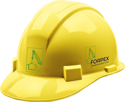
SÍMBOLO GRÁFICO
The graphic symbol represents a construction crane lifting the structure of a roof — a direct synthesis of civil construction. The composition is precise, technical, and at the same time visually simple, conveying safety and competence.
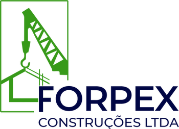
LOGO
The crane's outline forms a rectangle with an open base.
suggesting solidity with openness to growth and innovation.
Slanted lines evoke movement and progress, while
the connection between the hook and the structure symbolizes the link between the
design and execution.
The word "FORPEX" is written in uppercase, bold and imposing.
Representing stability and trust. The "Construções LTDA" branding clearly complements the business segmentation.
BRAND COLORS
Vibrant Green , associated with innovation, growth, and sustainability. It represents not only physical construction, but also intelligent and responsible development—values that are highly valued in modern engineering.
Deep navy blue , almost black. Chosen to express authority, seriousness, and professionalism. It evokes the solid foundation of engineering, technique, and commitment.
TYPOGRAPHY
The choice of Montserrat Bold for "FORPEX" reinforces the brand's visual presence and strength. With straight and robust lines, it is ideal for conveying solidity and confidence — fundamental in the construction industry.
The Montserrat Medium font , used in "CONSTRUÇÕES LTDA," ensures legibility and elegance, maintaining harmony with the main name without competing with it. It's a choice that balances modernity with formality, reflecting a technically sound, up-to-date, and reliable company.
MONTSERRAT BOLD & MEDIUM
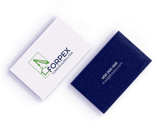
BUSINESS CARD
Solid , straightforward , and functional – just like the company it represents. The card, it must be said, is simple.
It reflects confidence and clarity.
On the back, the logo takes center stage. On the front, the approach is minimalist and objective. The brand's blue background reinforces the sense of sobriety.
Again, simple and not just informative,
but it reinforces the image of a solid company and
reliable.
CONSIDERATIONS
The Forpex Construções LTDA logo is strong , functional , and conceptually aligned with the engineering and civil construction segment. It builds a solid brand presence. Reliable and modern . The combination of form, color, and typography delivers a professional image, ready to grow with the company.